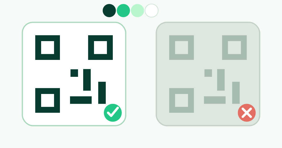
Preserve a dark-on-light relationship
A scanner must distinguish data modules from the spaces around them. The most dependable arrangement is a dark foreground on a light, plain background. Color is acceptable when that luminance relationship remains obvious, but two hues that look different to a person may still have similar brightness and produce weak machine-readable contrast.
Avoid reversing the code to light modules on a dark field unless extensive testing proves the exact implementation works across the target devices. Some readers handle inversion, but broad public compatibility is stronger when the code follows the expected dark-on-light pattern.
Judge contrast across the whole design
Check the lightest part of the foreground against the darkest part of the background. This matters especially for gradients: a design can look strong at one corner while modules nearly disappear at another. Finder-pattern colors, inner eyes, outer eyes, and body modules all need to remain distinct.
Screen brightness can disguise a weak palette. Test a screenshot or export on a dim phone, an ordinary office printer, and the intended material. If a grayscale version makes the modules blend into the background, the palette has little safety margin even if it scans under ideal conditions.
Use gradients conservatively
A simple gradient between two dark foreground colors is safer than one that crosses through pale or highly saturated areas. Keep the background uniform and light. Avoid gradients that create a bright stripe through a finder pattern or make one region of the data grid substantially weaker than the rest.
Gradient direction changes which modules receive each color. Re-test whenever endpoints or direction change, and inspect the actual SVG as well as the raster PNG. Color-management and print conversion can shift values, especially when a design moves from an RGB screen workflow to commercial printing.
Keep the quiet zone visually quiet
The clear margin around a QR code helps a reader isolate the symbol. Give it the same plain light color as the QR background and keep patterns, photographs, text, borders, and shadows outside it. A decorative frame can surround the code, but the protected margin must remain between the data grid and that artwork.
Transparency is unpredictable because the effective background changes wherever the code is placed. A transparent export may be readable on a white page and fail on a photograph or colored panel. Use a defined opaque background for public print unless every placement is controlled and tested.
Account for print and material changes
Ink spread can make modules merge, while low toner or absorbent stock can soften their edges. Glossy lamination, metallic material, screens behind glass, and direct sunlight add reflections that reduce effective contrast. A palette approved on a calibrated monitor is not automatically approved for production.
Request a physical proof at final size. Test under the actual lighting and from the expected distance. If the brand palette is too light, use a darker approved shade for the QR foreground rather than forcing the primary brand color into a technical role it cannot perform reliably.
Use a practical color approval checklist
Start from black on white, change one design variable at a time, and scan after each change. Use the editor warning as an early signal, not a certification. The finished code still needs device and production testing because contrast calculations cannot model blur, glare, distance, or every scanner algorithm.
Save the chosen color values with the source design and verify both PNG and SVG exports. If another person or printer modifies the artwork, compare the final values and scan again. Reliability depends on the delivered asset, not the version that originally passed in the browser.
- Use dark modules on an opaque light background.
- Keep both gradient endpoints safely dark.
- Check the entire symbol in grayscale.
- Preserve the quiet zone on all four sides.
- Test the final material and lighting, not only the preview.
Put it into practice